The Concept: The Megbook Experience
The goal was to bridge the gap between a deep historical archive and a modern, scannable magazine. I designed a custom grid system that allows 130 pages of dense information to breathe, using large-scale typography and AI-enhanced visual storytelling to keep the reader engaged from cover to cover.
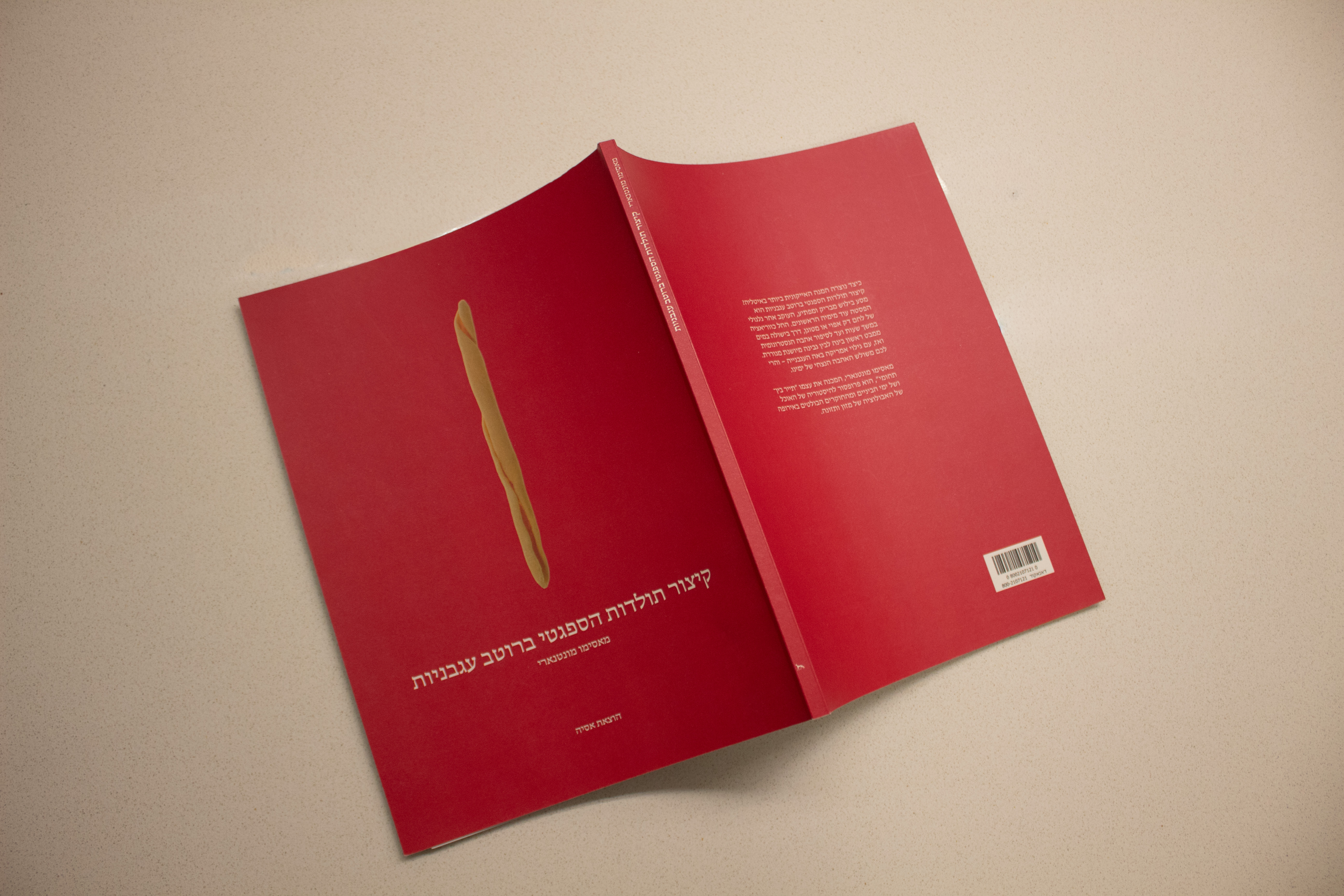
Physical Product: 130 Pages Megbook
Design System
Information Architecture & Grid System
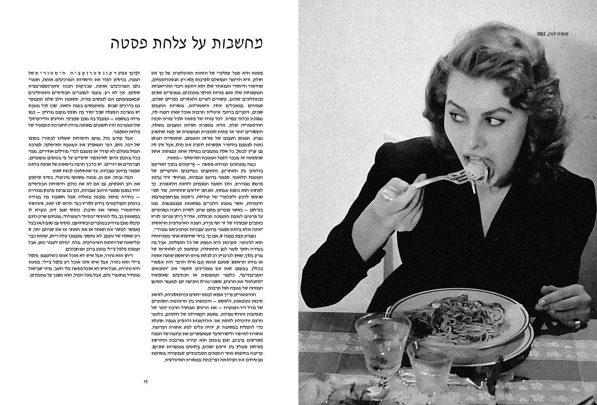
To maintain consistency across 130 pages, I developed a modular grid system. This allowed for a dynamic 'Pacing' alternating between high-density historical data and minimalist visual breathing spaces.
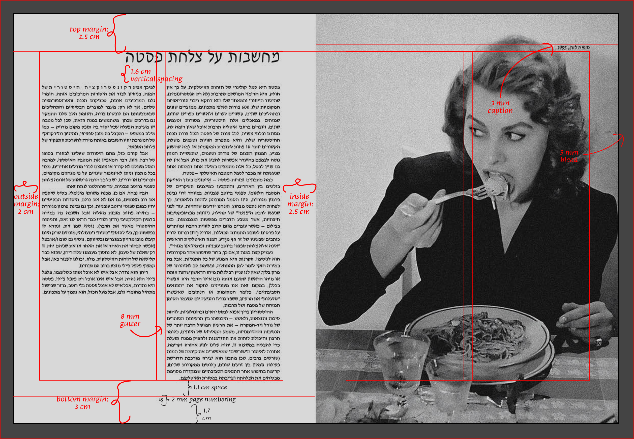
״Slightly larger than A4” 21 x 28.5 cm book layout
Typography
Headlines
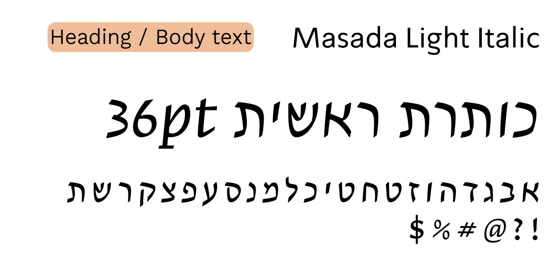
Masada: The cursive style was chosen to introduce a fluid, rhythmic movement that subtly echoes the organic forms of the pasta itself.
Hadassah:It is the most prestigious and elegant font in Hebrew typography, providing the project with a sense of cultural dignity that is both deeply rooted and modern."
Heading /
Body Text
Masada Light Italic
כותרת ראשית 36pt
אבגדהוזחטיכלמנסעפצקרשת
1234567890
Body Text
A contemporary bilingual serif inspired by mid-century calligraphy. The Light weight ensures a clean, legible reading experience across dense historical narratives, creating a balanced 'text color' on the page.
Body Text
Masada Light
קיצור תולדות הספגטי ברטב 9.5pt
אבגדהוזחטיכלמנסעפצקרשת
1234567890
Table of Contents: The Culinary Menu
The Table of Contents reimagined as a culinary menu. By using distinct pasta shapes as visual markers and high-contrast white typography on the primary brand red, the interface ensures maximum legibility while maintaining a bold, immersive brand identity.
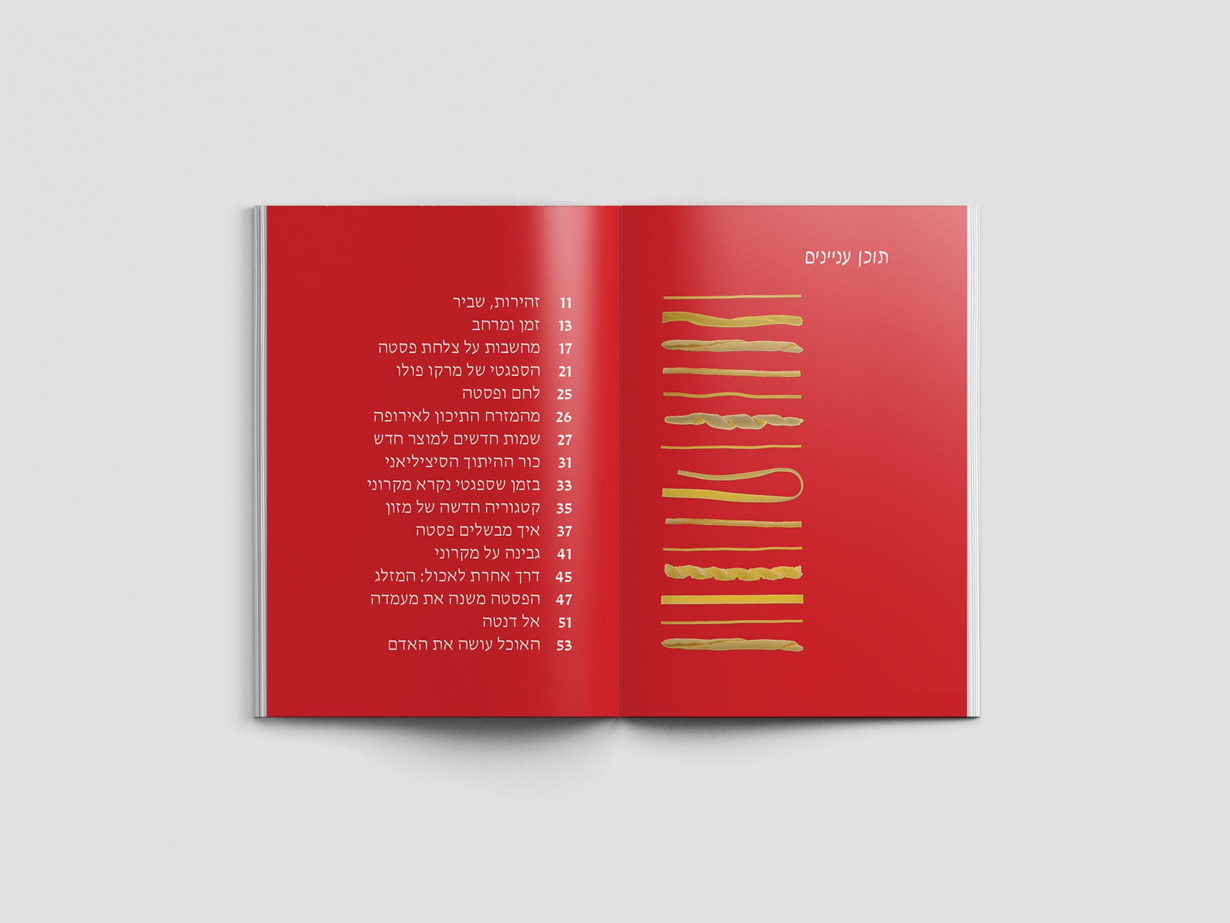
Table of Contents
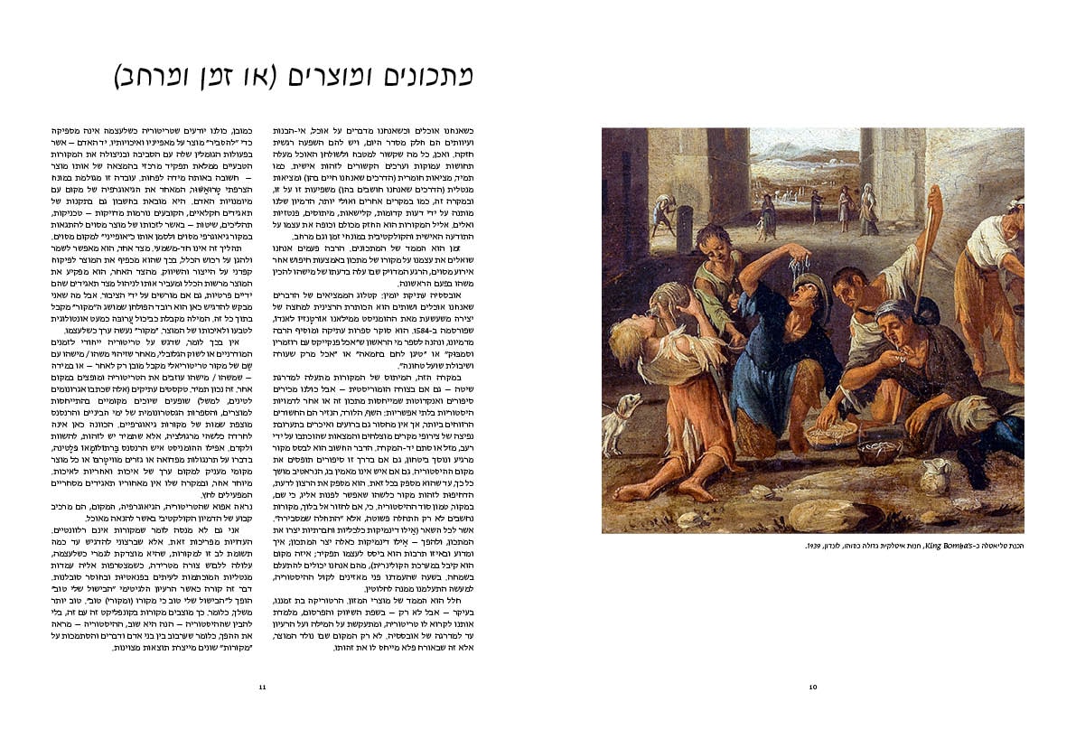
Recipes & Ingredients (or Time & Space)
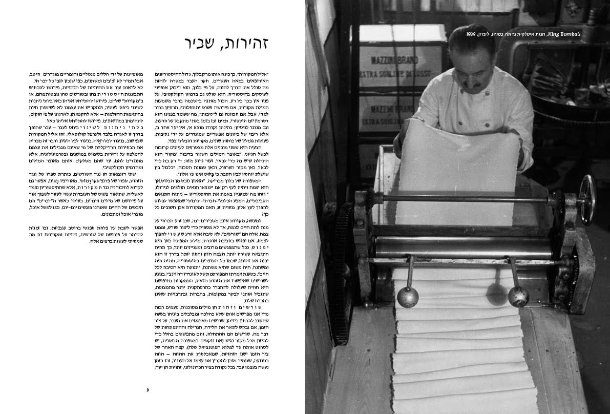
Handle with Care
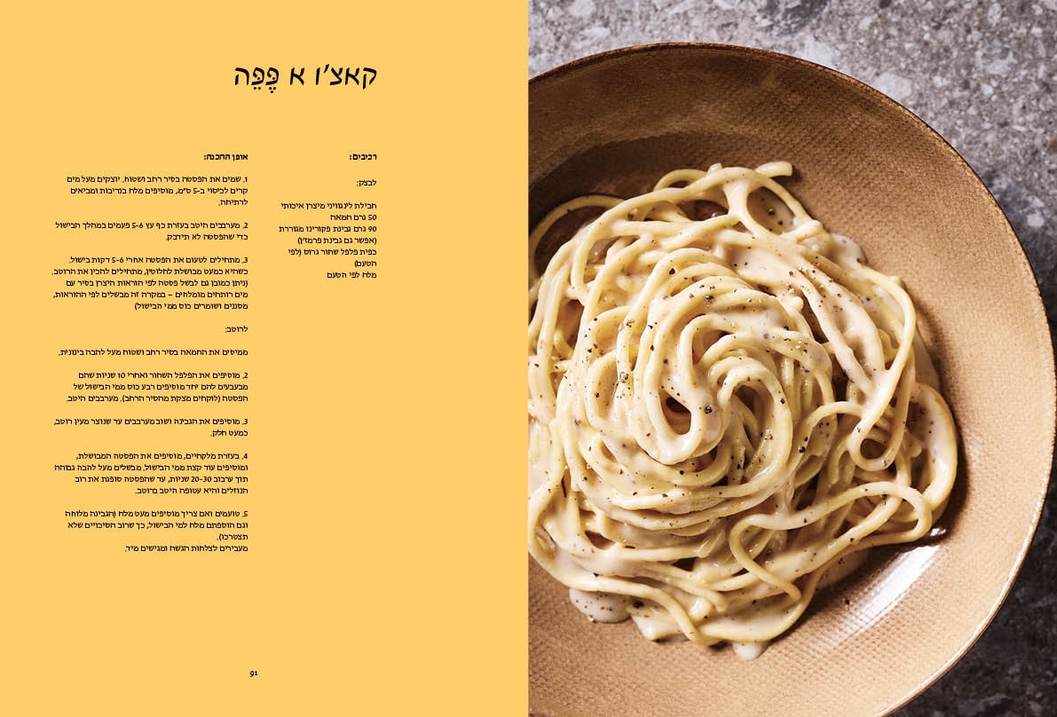
Cacio e Pepe: The recipe invented the moment they discovered cheese had flavor.
AI Restoration:
Reviving the Archive
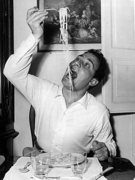
I curated a collection of rare archival images featuring both industrial pasta production and celebrities caught in 'clumsy' moments of consumption. This juxtaposition highlights pasta as the ultimate social equalizer: a high-culture staple that defies 'classy' etiquette. To bring these rare, low-resolution archives to a large-scale print format, I utilized AI upscaling and Photoshop restoration. This allowed me to significantly enhance image quality, ensuring every detail was sharp enough to accommodate the book's custom dimensions and full-bleed layouts.
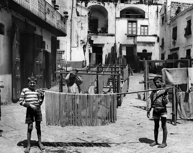
Before
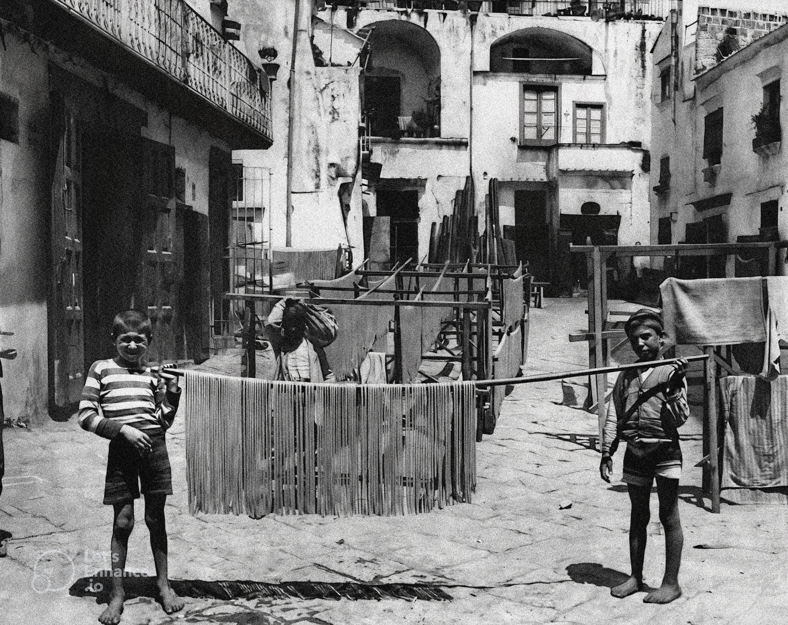
After
Before

After
Material & Texture
To bridge the gap between historical archives and a premium tactile experience, I selected Cando Silk paper. The interior (140gsm) offers a smooth, high-fidelity surface that preserves the intricate details of the AI-restored imagery, while the heavyweight cover (300gsm) provides a substantial, durable structure for the 130-page publication.
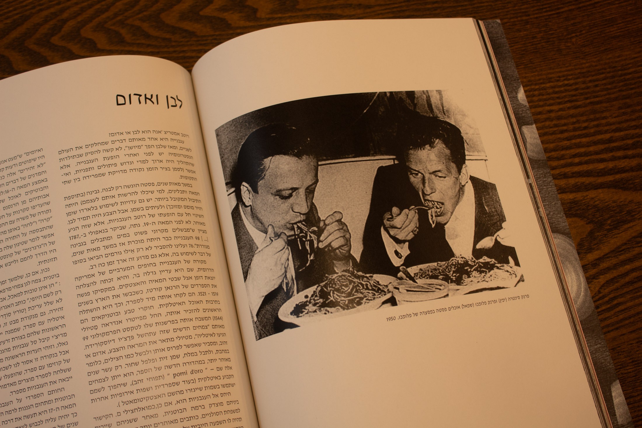
Cando Paper (Printed at Y-Print Florentine)
ronniebenhaim@gmail.com
Designed & built by me

Editorial UX • AI Restoration • Information Architecture • InDesign • Photoshop • Lightroom
A Short History of Spaghetti with Tomato Sauce
Re-architecting 130 years of history into a "Megbook" format.
The Concept: The Megbook Experience
The goal was to bridge the gap between a deep historical archive and a modern, scannable magazine. I designed a custom grid system that allows 130 pages of dense information to breathe, using large-scale typography and AI-enhanced visual storytelling to keep the reader engaged from cover to cover.

Physical Product: 130 Pages Megbook
Design System
Information Architecture & Grid System
To maintain consistency across 130 pages, I developed a modular grid system. This allowed for a dynamic 'Pacing' alternating between high-density historical data and minimalist visual breathing spaces.

״Slightly larger than A4” 21 x 28.5 cm book layout
Typography
Headlines
Masada: The cursive style was chosen to introduce a fluid, rhythmic movement that subtly echoes the organic forms of the pasta itself.
Hadassah:It is the most prestigious and elegant font in Hebrew typography, providing the project with a sense of cultural dignity that is both deeply rooted and modern."
Body Text
A contemporary bilingual serif inspired by mid-century calligraphy. The Light weight ensures a clean, legible reading experience across dense historical narratives, creating a balanced 'text color' on the page.
Body Text
Masada Light
קיצור תולדות הספגטי ברטב 9.5pt
אבגדהוזחטיכלמנסעפצקרשת
1234567890
Table of Contents: The Culinary Menu
The Table of Contents reimagined as a culinary menu. By using distinct pasta shapes as visual markers and high-contrast white typography on the primary brand red, the interface ensures maximum legibility while maintaining a bold, immersive brand identity.

Table of Contents

Recipes & Ingredients (or Time & Space)

Handle with Care

Cacio e Pepe: The recipe invented the moment they discovered cheese had flavor.
AI Restoration: Reviving the Archive
I curated a collection of rare archival images featuring both industrial pasta production and celebrities caught in 'clumsy' moments of consumption. This juxtaposition highlights pasta as the ultimate social equalizer: a high-culture staple that defies 'classy' etiquette. To bring these rare, low-resolution archives to a large-scale print format, I utilized AI upscaling and Photoshop restoration. This allowed me to significantly enhance image quality, ensuring every detail was sharp enough to accommodate the book's custom dimensions and full-bleed layouts.

Before

After

Before

After
Material & Texture
To bridge the gap between historical archives and a premium tactile experience, I selected Cando Silk paper. The interior (140gsm) offers a smooth, high-fidelity surface that preserves the intricate details of the AI-restored imagery, while the heavyweight cover (300gsm) provides a substantial, durable structure for the 130-page publication.

Cando Paper (Y-Print Florentine): Bridging the gap between historical archives and a premium tactile experience.
ronniebenhaim@gmail.com
0542336061
Designed & built by me
Tel-Aviv, Israel

Editorial UX • AI Restoration • Information Architecture • InDesign • Photoshop • Lightroom
A Short History of Spaghetti with Tomato Sauce
Re-architecting 130 years of history into a "Megbook" format.
The Concept: The Megbook Experience
The goal was to bridge the gap between a deep historical archive and a modern, scannable magazine. I designed a custom grid system that allows 130 pages of dense information to breathe, using large-scale typography and AI-enhanced visual storytelling to keep the reader engaged from cover to cover.

Physical Product: 130 Pages Megbook
Design System
Information Architecture & Grid System
To maintain consistency across 130 pages, I developed a modular grid system. This allowed for a dynamic 'Pacing' alternating between high-density historical data and minimalist visual breathing spaces.
5 mm
bleed
3 mm
caption
8 mm
gutter
top margin:
2.5 cm
1.6 cm
vertical spacing
bottom margin:
3 cm
1.7
cm
2 mm page numbering
1.1 cm space
inside
margin:
2.5 cm
outside
margin:
2 cm
״Slightly larger than A4” 21 x 28.5 cm book layout
Typography
Headlines
Masada: The cursive style was chosen to introduce a fluid, rhythmic movement that subtly echoes the organic forms of the pasta itself.
Hadassah:It is the most prestigious and elegant font in Hebrew typography, providing the project with a sense of cultural dignity that is both deeply rooted and modern."
Heading / Body text
Masada Light Italic
כותרת ראשית 36pt
אבגדהוזטחטיכלמנסעפצקרשת
!?@#%$
Body Text
A contemporary bilingual serif inspired by mid-century calligraphy. The Light weight ensures a clean, legible reading experience across dense historical narratives, creating a balanced 'text color' on the page.
Body Text
Masada Light
קיצור תולדות הספגטי ברטב 9.5pt
אבגדהוזחטיכלמנסעפצקרשת
1234567890
Table of Contents: The Culinary Menu
The Table of Contents reimagined as a culinary menu. By using distinct pasta shapes as visual markers and high-contrast white typography on the primary brand red, the interface ensures maximum legibility while maintaining a bold, immersive brand identity.

Table of Contents

Recipes & Ingredients (or Time & Space)

Handle with Care

Cacio e Pepe: The recipe invented the moment they discovered cheese had flavor.
AI Restoration: Reviving the Archive
I curated a collection of rare archival images featuring both industrial pasta production and celebrities caught in 'clumsy' moments of consumption. This juxtaposition highlights pasta as the ultimate social equalizer: a high-culture staple that defies 'classy' etiquette. To bring these rare, low-resolution archives to a large-scale print format, I utilized AI upscaling and Photoshop restoration. This allowed me to significantly enhance image quality, ensuring every detail was sharp enough to accommodate the book's custom dimensions and full-bleed layouts.

Before

After

Before

After
Material & Texture
To bridge the gap between historical archives and a premium tactile experience, I selected Cando Silk paper. The interior (140gsm) offers a smooth, high-fidelity surface that preserves the intricate details of the AI-restored imagery, while the heavyweight cover (300gsm) provides a substantial, durable structure for the 130-page publication.

Cando Paper (Y-Print Florentine): Bridging the gap between historical archives and a premium tactile experience.
ronniebenhaim@gmail.com
0542336061
Designed & built by me
Tel-Aviv, Israel