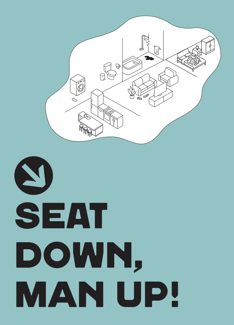
2025 · Website · Brand system & UX · Illustration, UI · Figma · Figma Sites
A visual guide for friction-free relationships
The Challenge
Daily friction between couples often arises from household habits and maintenance. Direct feedback frequently leads to defensiveness, arguments, and a sense of 'nagging,' which hinders genuine behavioral change and creates unnecessary tension within the relationship.
Visual reference from vintage airline safety
card manuals
The Solution
A digital platform featuring 10 humorous, illustrated guides. By transforming criticism into a lighthearted visual message, it allows partners to send a quick 'reminder' via mobile. This approach softens the feedback, turning a potential conflict into a shared moment of humor that encourages behavioral change.
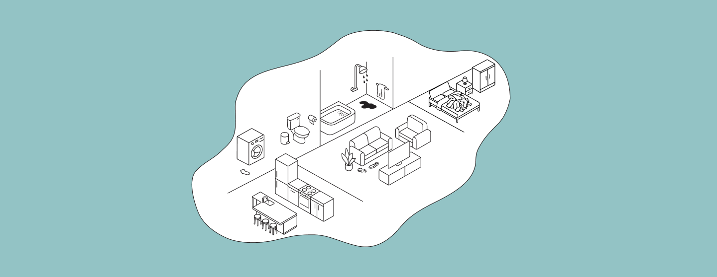
The Hero Section Of The Website
Design Inspirations
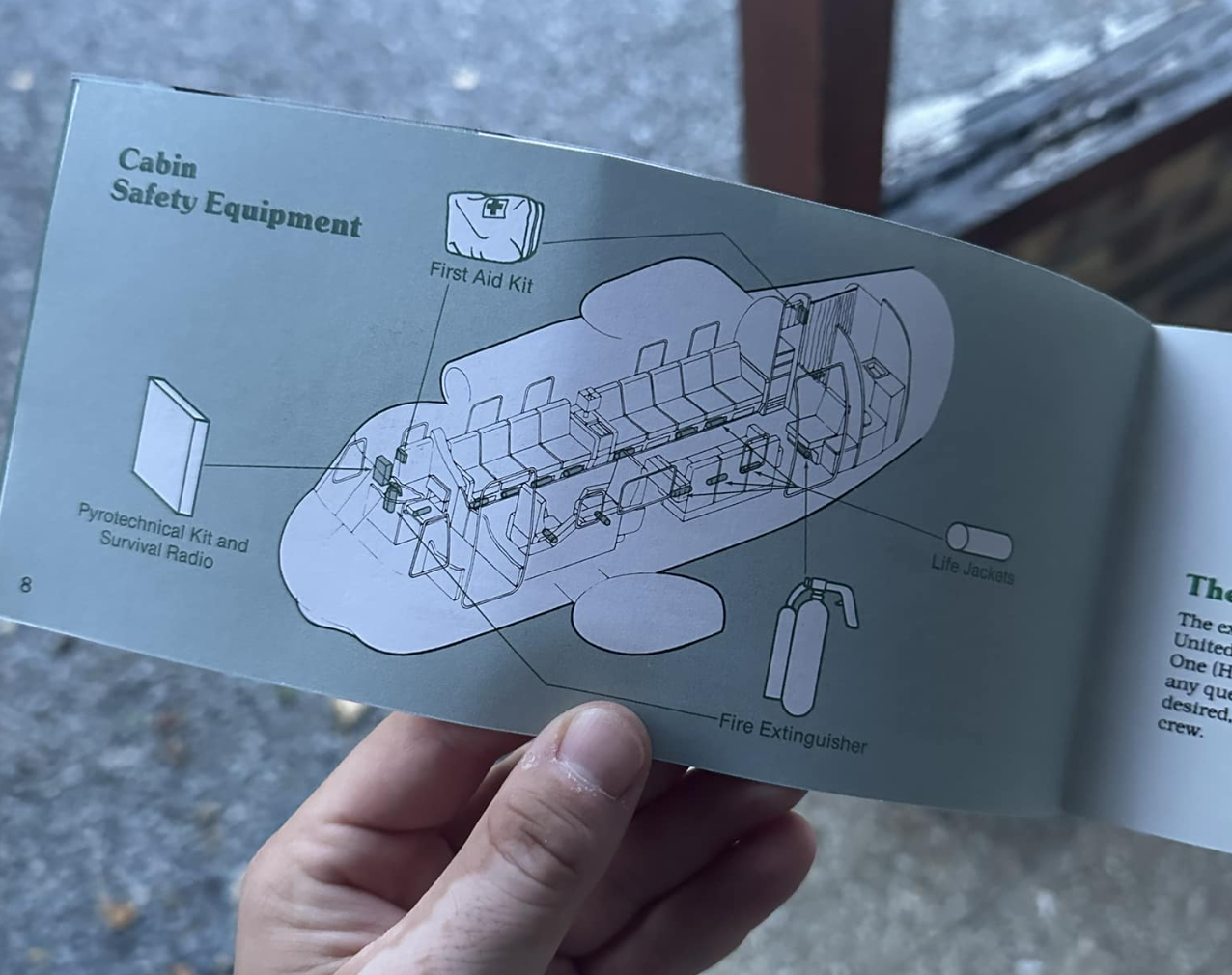
Airlines Safety Cards Aesthetic
I drew inspiration from the calm, structured clarity of flight safety cards, which are designed to deliver essential information in high-pressure moments.
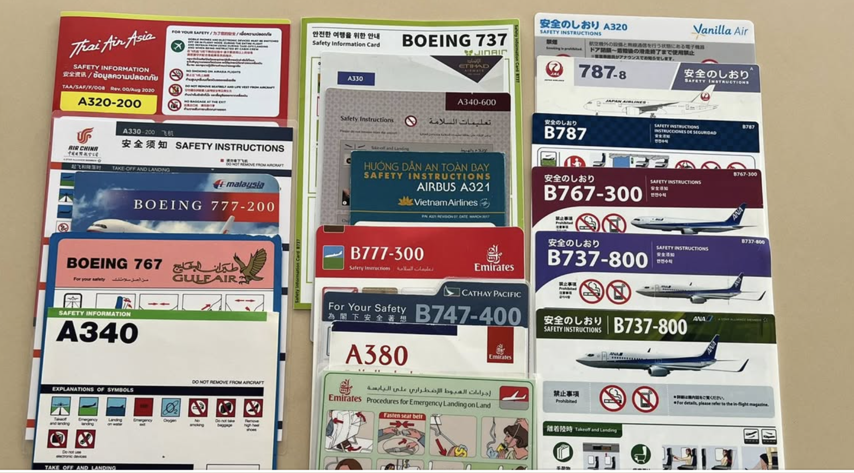
Vintage Aviation Manuals
Japanese Technical Guides
From Japanese manuals, I adopted the philosophy of extreme detail and precision, ensuring that every movement is so clearly explained that there is zero room for error.
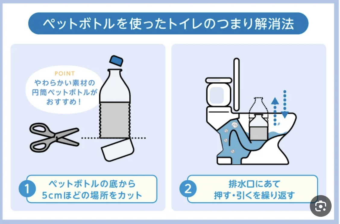
“How to unclog your toilet” Japanese manual
IKEA Instructions
I integrated the iconic, wordless storytelling and lighthearted humor of IKEA, using a friendly illustrative style to soften the "instructional" tone.
By merging these styles, I transformed daily household friction into an aesthetic, clear, and humorous visual experience—turning a potential argument into a shared laugh.
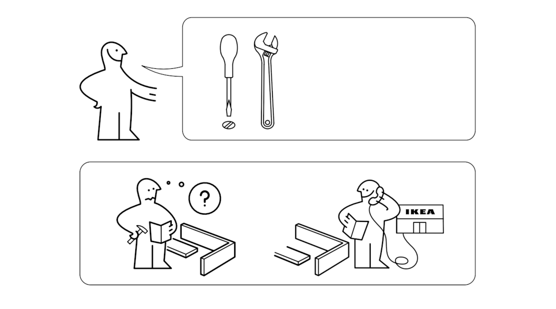
IKEA Instructions
The Visuals

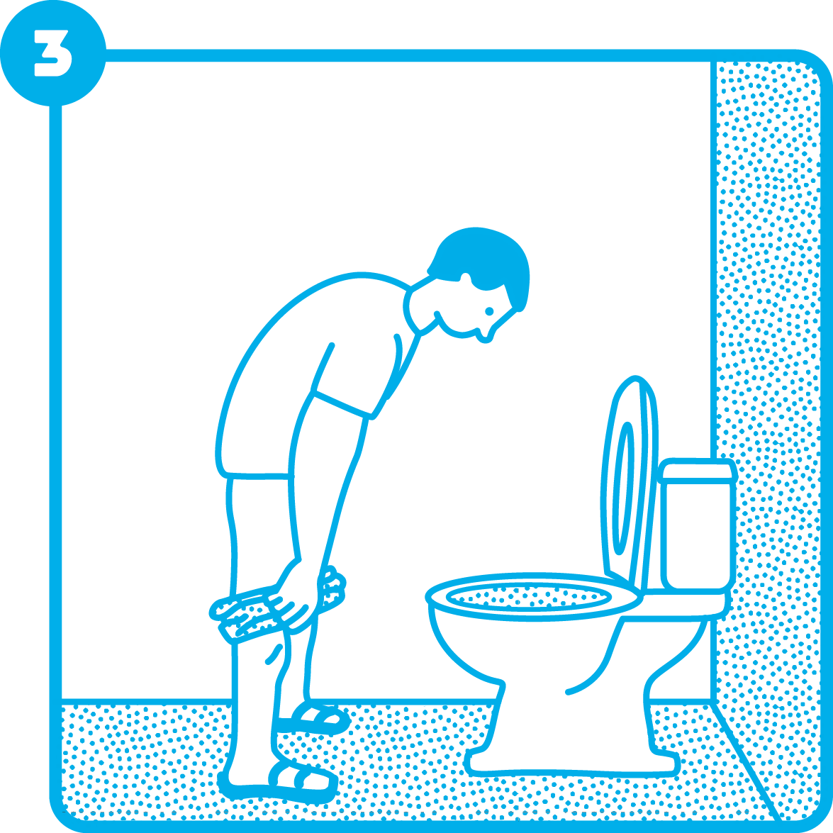
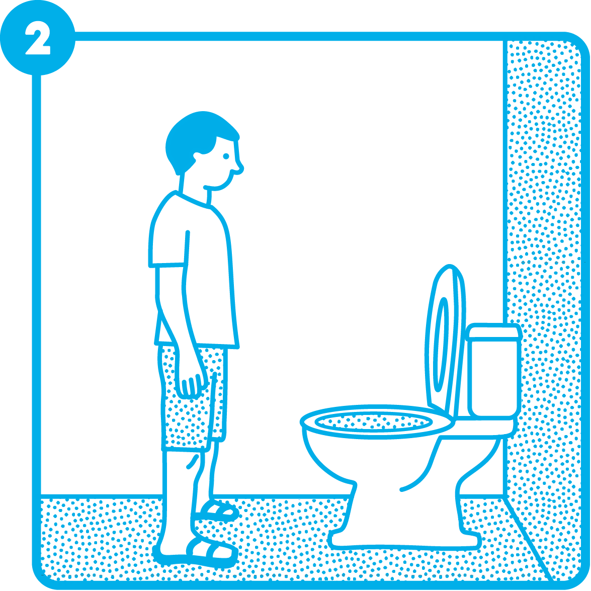
How To Shave without leaving a trace
How to Avoid "friendly fire"
How to Score a "Laundry Slam Dunk"
How To Keep Your Plants Alive
Mobile View
Guide’s Mobile Header
Step-by-step
Guide’s Buttons Layout
Product Context: Strategic Delivery
Because a reminder is only effective if it’s actually seen,
I designed a multi-stage communication system tailored to the partner's "responsiveness" level:This approach transforms household nagging into a structured, playful protocol, ensuring the message is delivered without the drama.
WhatsApp Quick-Send
The first line of communication—a lighthearted, digital nudge sent directly to their chat for an instant, humorous reminder.
Email Formal-Nudge
For when the message gets "buried" in the feed, this provides a slightly more formal digital paper trail to ensure it doesn't go unnoticed.
Ready To Print PDF
The ultimate solution for the "persistently distracted." A ready-to-print version designed to be left on the desk, the fridge, or the "crime scene" itself (like the laundry chair).
The Design System Behind the Stories
Custom Cursor
Designed as a cleaning glove, turning the pointer into a functional metaphor and reinforcing the project’s core theme of domestic labor and cleanliness.

Defult

Pointer
Color Palette
Deep Ink

221F20
Shower

ED237F
Living Room

0C7B3B
Toilets

23A9E1
Laundry

F36B21
Rationale
The color palette is inspired by high-visibility safety indicators. Each 'scenario' is assigned a distinct primary color to create immediate visual separation between different household zones.
Emotional Impact
By using vibrant, saturated tones, I transformed potentially tense topics into a colorful and engaging experience.
Accessibility
The high contrast between the bold backgrounds and the clean line art ensures that the instructions remain legible and clear across all digital and physical touchpoints.
Brand Color Palette
A professional palette of deep blues and muted teals, selected to create a functional and grounded backdrop. These neutral tones ensure clarity for operational instructions, specifically tailored to the project's target audience.

221F20

ED237F

0C7B3B
High-contrast shades (like the bright yellow and magenta) were specifically designated for CTA buttons and system feedback, ensuring the most important actions stand out clearly against the brand backgrounds.

132559

23ED91

FFF700

ED237F
Typography
Bold & Protest-Driven
Levit 1950 is a modern evolution of the iconic 'Haim' typeface—a dramatic and charismatic font deeply rooted in Israeli culture. I chose it for its thick, bold, and fearless presence, featuring distinct ink traps that emphasize its industrial feel. Since this project is inherently a form of protest against household friction, the font’s association with public announcements and social movements was the perfect fit to amplify the message."
Functional
For operational instructions and long-form copy, I chose Simpler Regular. As its name suggests, it provides a clean, neutral, and highly legible experience. In a project centered around functional safety guides, there is no room for error. this font ensures that technical details remain straightforward and easy to digest at a glance.
Iconography & Elements

brand voice
Empathetic illustrations designed to humanize the experience and soften the instructional tone.
ui actions

הדפסה

שיתוף
בוואטספ

שיתוף
באימייל

למדריך
הבא

הדפסה

שיתוף
בוואטספ

שיתוף
באימייל

למדריך
הבא

הדפסה

שיתוף
בוואטספ

שיתוף
באימייל

למדריך
הבא

הדפסה

שיתוף
בוואטספ

שיתוף
באימייל

למדריך
הבא
Dynamic components that adapt their color scheme to provide a seamless, context-aware experience.
Annotation Kit

A set of technical markers and arrows, ensuring clarity across every guide.
Components & Buttons
Hero Component (Menu)
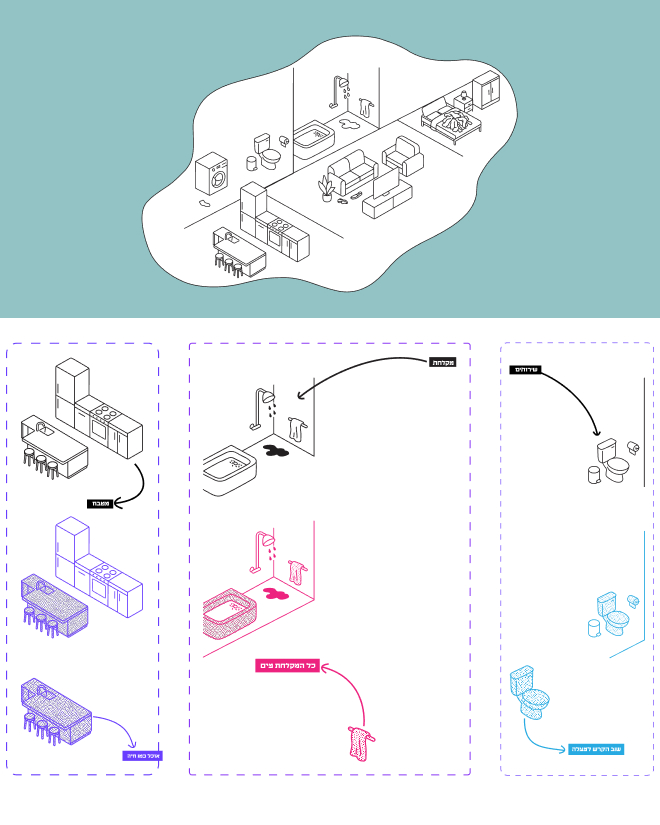
The Hero section features an interactive map that serves as the site's primary navigation. Using hover states, each household area dynamically lights up in its category color, providing immediate visual feedback. Within these areas, specific items act as triggers; hovering over them reveals the guide's title, allowing users to intuitively explore and discover content through a playful, spatial interface.
Instructional Components


To minimize cognitive load, each step in the guide is built as a dynamic component. I implemented a timed reveal for the Annotation Kit elements—arrows and highlights appear a few seconds after the step is displayed. This UX strategy ensures the user first absorbs the visual context before receiving specific technical instructions, creating a more intuitive and less overwhelming learning experience.
Navigation Buttons


מדריך פעולה

מדריך פעולה

לעוד עדויות

לעוד עדויות
A set of high-contrast action buttons designed for clear navigation. These components utilize the brand’s core palette—Bright Yellow for primary calls to action and Deep Blue for secondary links. Each button is built with distinct hover and active states to provide intuitive user feedback throughout the site.
Responsive Testimonials
מצאתי **** בכיור פעם אחת!!! תגידו לי זה אמיתי?

Web
Mobile

מצאתי **** בכיור פעם אחת!!! תגידו לי זה אמיתי?
To maintain readability across all platforms, I designed a fluid testimonial component. In the Web Version, the card uses a horizontal layout to fit the desktop grid, while the Mobile Version automatically stacks the elements vertically, ensuring the text remains clear and the brand character stays prominent even on smaller screens."
Real Stories
To identify which guides were truly needed, I interviewed women about their daily household frustrations. I transformed these authentic, humorous responses into a set of reusable components. By building them as smart components with defined typography and color variables, I ensured that these real-life friction points integrate seamlessly into the overall Design System while maintaining a relatable brand experience.
״
שלי קפלן

שהצלחות לא נקיות ליד הכיור ולא בתוך!!!!! יכולה לתלוש שיערות בגלל זה. 4 שנים ביחד וזה הדבר היחיד שלא הצלחתי למגר (זה ונעליים בסלון)
״
ורה מורזה

גרביים מפוזרות בכל הבית, שאריות נייר טואלט בכיסים, גלילי נייר טואלט על הניאגרה, טיפות מים ומשחת שיניים על כל המראה באמבטיה
ronniebenhaim@gmail.com
Designed & built by me


seat down,
man up!
2025 · Website · Brand system & UX · Illustration, UI · Figma · Figma Sites
A visual guide for friction-free relationships
The Challenge
Daily friction between couples often arises from household habits and maintenance. Direct feedback frequently leads to defensiveness, arguments, and a sense of 'nagging,' which hinders genuine behavioral change and creates unnecessary tension within the relationship.
The Hero Section Of The Website
The Solution
A digital platform featuring 10 humorous, illustrated guides. By transforming criticism into a lighthearted visual message, it allows partners to send a quick 'reminder' via mobile. This approach softens the feedback, turning a potential conflict into a shared moment of humor that encourages behavioral change.
The Hero Section Of The Website
Design Inspirations
Safety Card Aesthetic
The visual language of this project was born from the intersection of three distinct worlds of instruction.
I drew inspiration from the calm, structured clarity of flight safety cards, which are designed to deliver essential information in high-pressure moments.
Vintage Aviation Manuals
Japanese Technical Guides
From Japanese manuals, I adopted the philosophy of extreme detail and precision, ensuring that every movement is so clearly explained that there is zero room for error.
“How to unclug your toilet” Japanese manual
IKEA Instructions
I integrated the iconic, wordless storytelling and lighthearted humor of IKEA, using a friendly illustrative style to soften the "instructional" tone.
By merging these styles, I transformed daily household friction into an aesthetic, clear, and humorous visual experience—turning a potential argument into a shared laugh.
IKEA Instructions
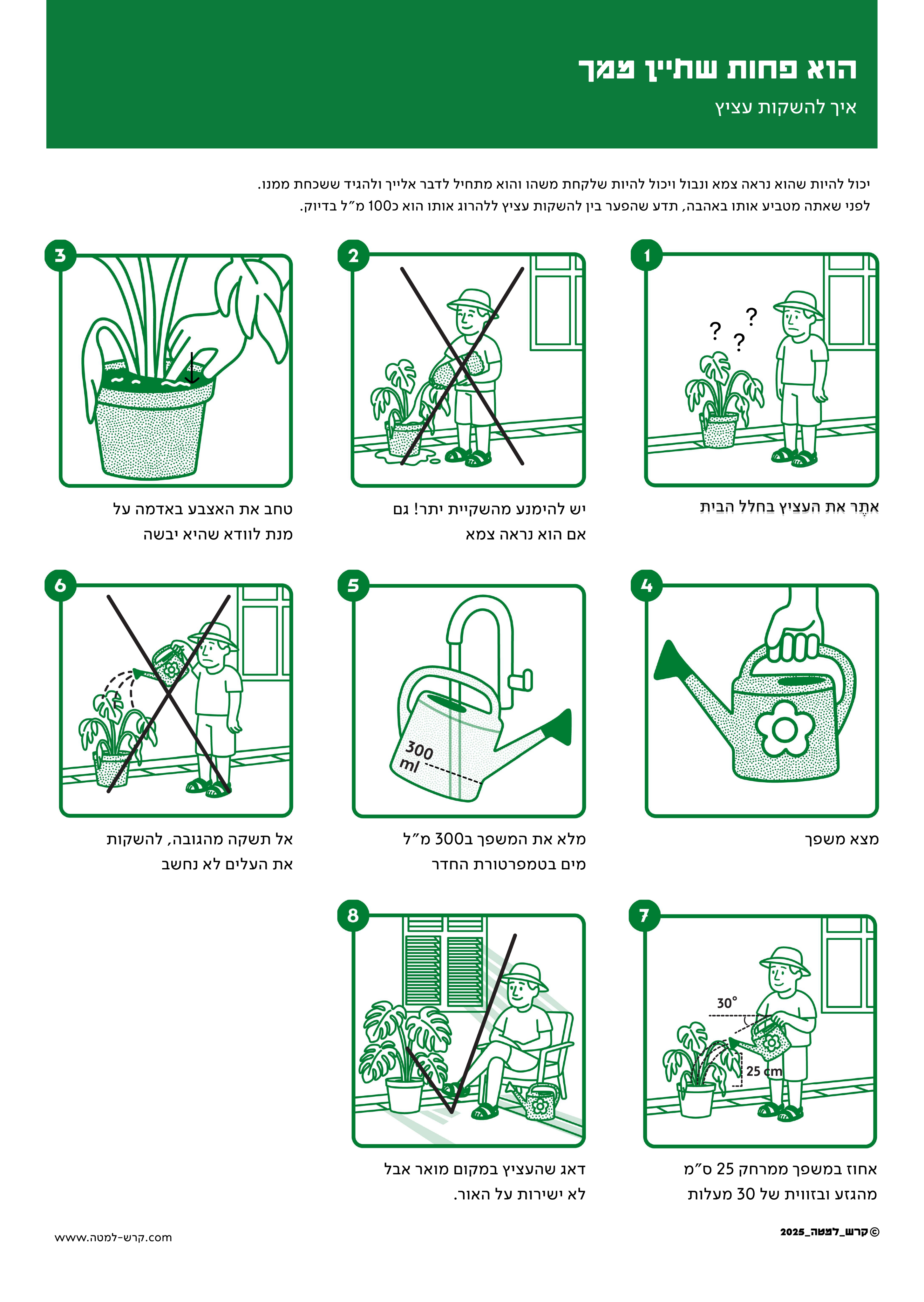
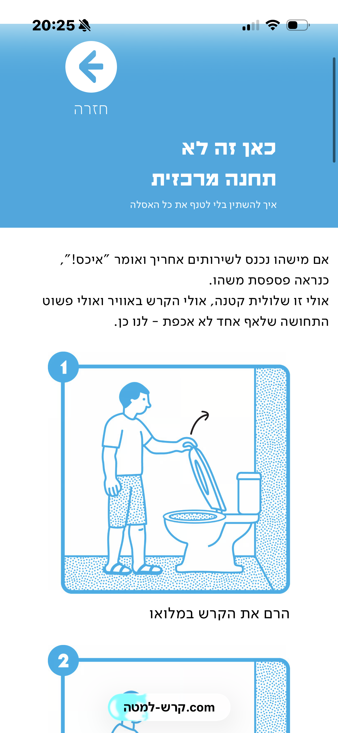
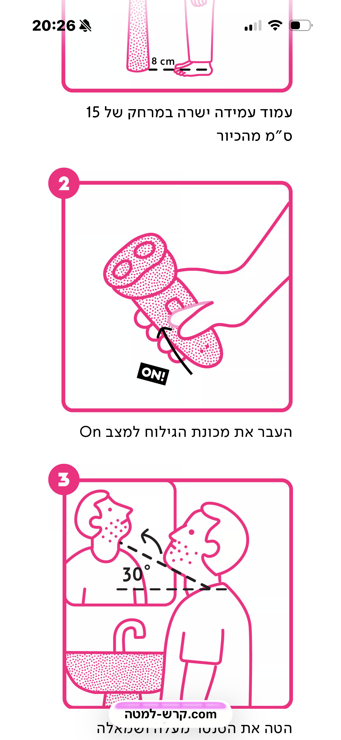
The Visuals
How To Shave without leaving a trace
How to Avoid "friendly fire"
How to Score a "Laundry Slam Dunk"
How To Keep Your Plants Alive
Mobile View
Guide’s Mobile Header
Step-by-step
Guide’s Buttons Layout
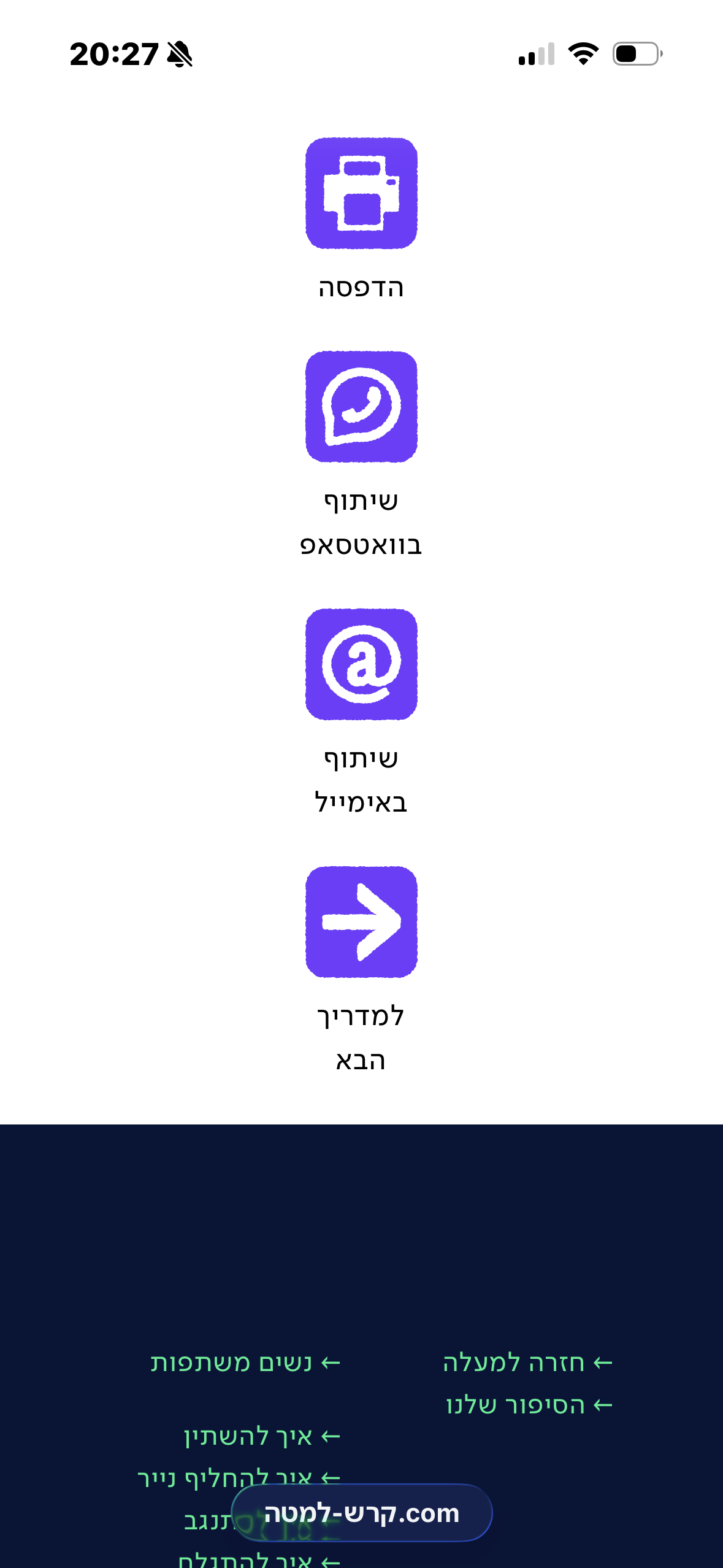
Product Context: Strategic Delivery
Focus on Channels
Because a reminder is only effective if it’s actually seen,
I designed a multi-stage communication system tailored to the partner's "responsiveness" level:This approach transforms household nagging into a structured, playful protocol, ensuring the message is delivered without the drama.
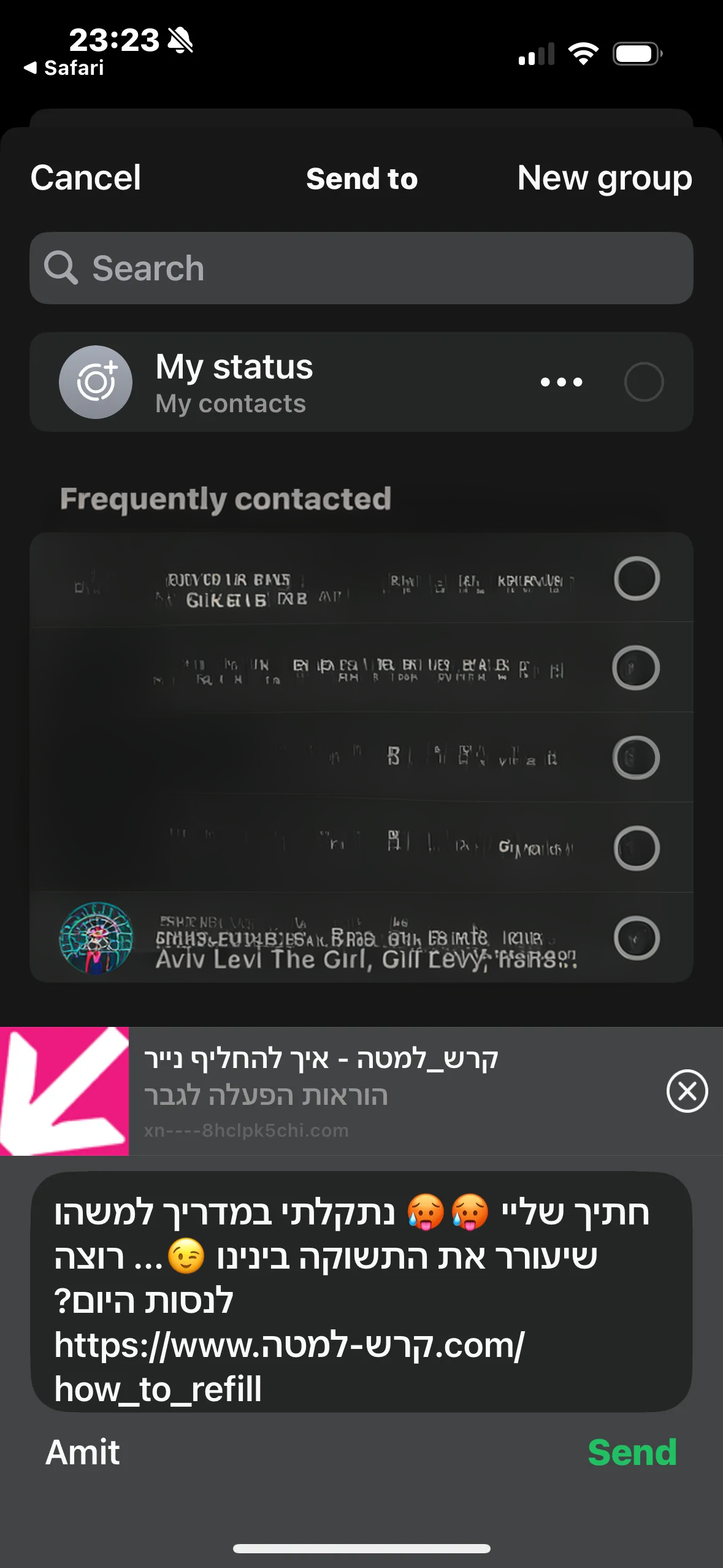
WhatsApp Quick-Send
Email Way
You can always print this out and leave it on the table.
WhatsApp Quick-Send
The first line of communication—a lighthearted, digital nudge sent directly to their chat for an instant, humorous reminder.
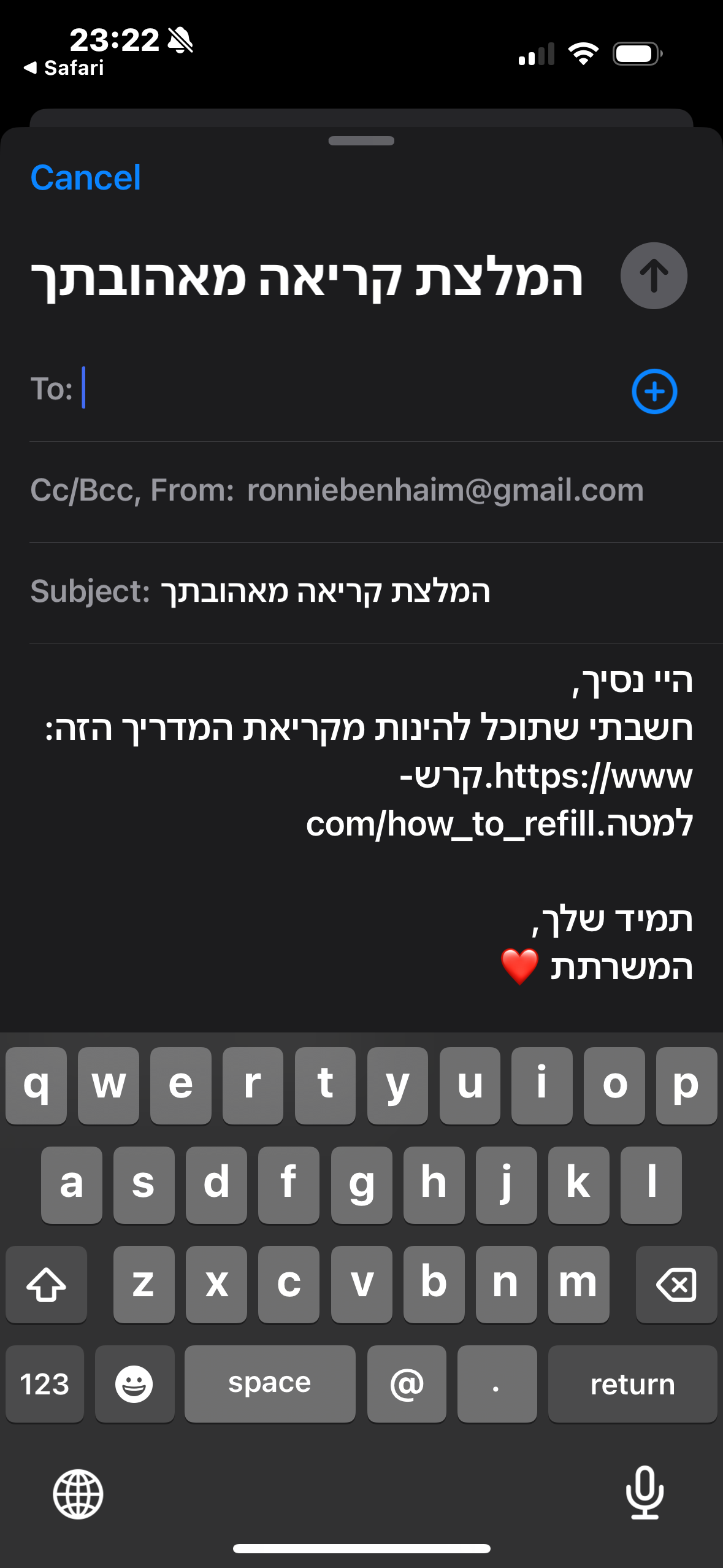
Email Formal-Nudge
For when the message gets "buried" in the feed, this provides a slightly more formal digital paper trail to ensure it doesn't go unnoticed.
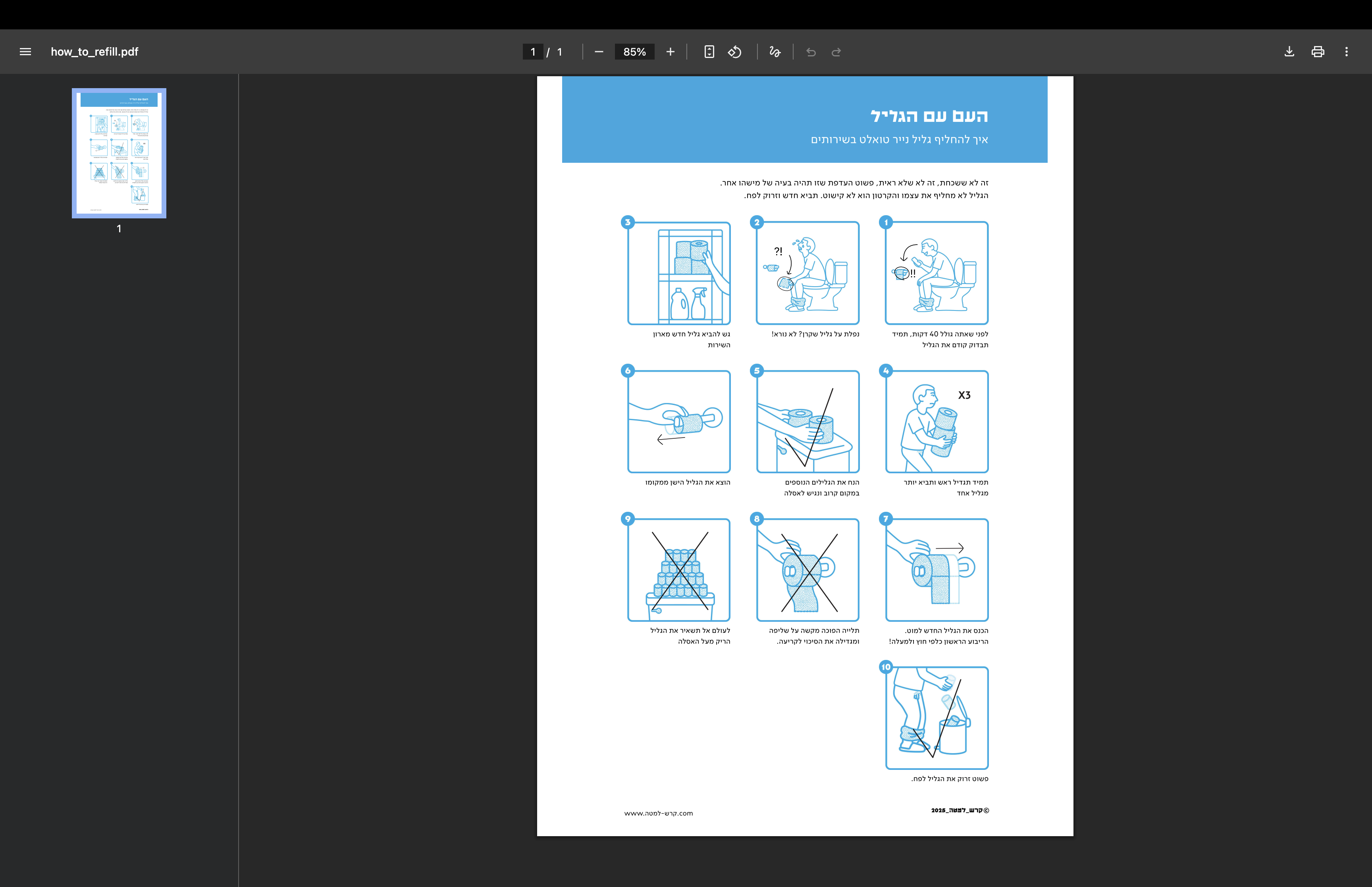
Ready To Print PDF
The ultimate solution for the "persistently distracted." A ready-to-print version designed to be left on the desk, the fridge, or the "crime scene" itself (like the laundry chair).
The Design System Behind the Stories
Custom Cursor
Designed as a cleaning glove, turning the pointer into a functional metaphor and reinforcing the project’s core theme of domestic labor and cleanliness.
Defult
Pointer
Color Palette
Deep Ink

221F20
Shower

ED237F
Living Room

0C7B3B
Toilets

23A9E1
Laundry

F36B21
Rationale
The color palette is inspired by high-visibility safety indicators. Each 'scenario' is assigned a distinct primary color to create immediate visual separation between different household zones.
Emotional Impact
By using vibrant, saturated tones, I transformed potentially tense topics into a colorful and engaging experience.
Accessibility
The high contrast between the bold backgrounds and the clean line art ensures that the instructions remain legible and clear across all digital and physical touchpoints.
Brand Color Palette
A professional palette of deep blues and muted teals, selected to create a functional and grounded backdrop. These neutral tones ensure clarity for operational instructions, specifically tailored to the project's target audience.

221F20

ED237F

0C7B3B
High-contrast shades (like the bright yellow and magenta) were specifically designated for CTA buttons and system feedback, ensuring the most important actions stand out clearly against the brand backgrounds.

132559

23ED91

FFF700

ED237F
Typography
Display / Logotype
לויט 1950
קרש למטה 83pt
אבגדהוזחטיכלמנסעפצקרשת
1234567890
Bold & Protest-Driven
Levit 1950 is a modern evolution of the iconic 'Haim' typeface—a dramatic and charismatic font deeply rooted in Israeli culture. I chose it for its thick, bold, and fearless presence, featuring distinct ink traps that emphasize its industrial feel. Since this project is inherently a form of protest against household friction, the font’s association with public announcements and social movements was the perfect fit to amplify the message."
Sub-heading / Body text
Simpler Regular
כותרת משנה 54pt
פתיח 38.5
הוראות הפעלה 33.5
אבגדהוזחטיכלמנסעפצקרשת
!?@#%$
Functional
For operational instructions and long-form copy, I chose Simpler Regular. As its name suggests, it provides a clean, neutral, and highly legible experience. In a project centered around functional safety guides, there is no room for error. this font ensures that technical details remain straightforward and easy to digest at a glance.
Iconography & Elements
brand voice
Empathetic illustrations designed to humanize the experience and soften the instructional tone.
ui actions
הדפסה
שיתוף
בוואטספ
שיתוף
באימייל
למדריך
הבא
הדפסה
שיתוף
בוואטספ
שיתוף
באימייל
למדריך
הבא
הדפסה
שיתוף
בוואטספ
שיתוף
באימייל
למדריך
הבא
הדפסה
שיתוף
בוואטספ
שיתוף
באימייל
למדריך
הבא
Dynamic components that adapt their color scheme to provide a seamless, context-aware experience.
Annotation Kit

A set of technical markers and arrows, ensuring clarity across every guide.
Components & Buttons


מטבח


אוכל כמו חיה


מקלחת


כל המקלחת מים


שירותים


שוב הקרש למעלה


The Hero section features an interactive map that serves as the site's primary navigation. Using hover states, each household area dynamically lights up in its category color, providing immediate visual feedback. Within these areas, specific items act as triggers; hovering over them reveals the guide's title, allowing users to intuitively explore and discover content through a playful, spatial interface.
Smart Instructional Components:To minimize cognitive load, each step in the guide is built as a dynamic component. I implemented a timed reveal for the Annotation Kit elements—arrows and highlights appear a few seconds after the step is displayed. This UX strategy ensures the user first absorbs the visual context before receiving specific technical instructions, creating a more intuitive and less overwhelming learning experience.
מצאתי **** בכיור פעם אחת!!! תגידו לי זה אמיתי?
Web Version
Mobile Version

מצאתי **** בכיור פעם אחת!!! תגידו לי זה אמיתי?
Responsive Testimonials:
To maintain readability across all platforms, I designed a fluid testimonial component. In the Web Version, the card uses a horizontal layout to fit the desktop grid, while the Mobile Version automatically stacks the elements vertically, ensuring the text remains clear and the brand character stays prominent even on smaller screens."
מדריך פעולה
מדריך פעולה
לעוד עדויות
לעוד עדויות
Dynamic Navigation Buttons:
A set of high-contrast action buttons designed for clear navigation. These components utilize the brand’s core palette—Bright Yellow for primary calls to action and Deep Blue for secondary links. Each button is built with distinct hover and active states to provide intuitive user feedback throughout the site.
Real Stories
To identify which guides were truly needed, I interviewed women about their daily household frustrations. I transformed these authentic, humorous responses into a set of reusable components. By building them as smart components with defined typography and color variables, I ensured that these real-life friction points integrate seamlessly into the overall Design System while maintaining a relatable brand experience.
״
שלי קפלן
שהצלחות לא נקיות ליד הכיור ולא בתוך!!!!! יכולה לתלוש שיערות בגלל זה. 4 שנים ביחד וזה הדבר היחיד שלא הצלחתי למגר (זה ונעליים בסלון)
״
ורה מורזה
גרביים מפוזרות בכל הבית, שאריות נייר טואלט בכיסים, גלילי נייר טואלט על הניאגרה, טיפות מים ומשחת שיניים על כל המראה באמבטיה


seat down,
man up!
2025 · Website · Brand system & UX · Illustration, UI · Figma · Figma Sites
A visual guide for friction-free relationships
The Challenge
Daily friction between couples often arises from household habits and maintenance. Direct feedback frequently leads to defensiveness, arguments, and a sense of 'nagging,' which hinders genuine behavioral change and creates unnecessary tension within the relationship.
Isometric technical illustration from a 1970s flight safety guide
The Solution
A digital platform featuring 10 humorous, illustrated guides. By transforming criticism into a lighthearted visual message, it allows partners to send a quick 'reminder' via mobile. This approach softens the feedback, turning a potential conflict into a shared moment of humor that encourages behavioral change.
The Hero Section Of The Website
Design Inspirations
Safety Card Aesthetic
The visual language of this project was born from the intersection of three distinct worlds of instruction.
I drew inspiration from the calm, structured clarity of flight safety cards, which are designed to deliver essential information in high-pressure moments.
Vintage Aviation Manuals
Japanese Technical Guides
From Japanese manuals, I adopted the philosophy of extreme detail and precision, ensuring that every movement is so clearly explained that there is zero room for error.
“How to unclog your toilet” Japanese manual
IKEA Instructions
I integrated the iconic, wordless storytelling and lighthearted humor of IKEA, using a friendly illustrative style to soften the "instructional" tone.
By merging these styles, I transformed daily household friction into an aesthetic, clear, and humorous visual experience—turning a potential argument into a shared laugh.
IKEA Instructions
The Visuals
How To Shave without leaving a trace
How to Avoid "friendly fire"
How to Score a "Laundry Slam Dunk"
How To Keep Your Plants Alive
Mobile View
Guide’s Mobile Header
Step-by-step
Footer
Product Context: Strategic Delivery
Focus on Channels
Because a reminder is only effective if it’s actually seen,
I designed a multi-stage communication system tailored to the partner's "responsiveness" level:This approach transforms household nagging into a structured, playful protocol, ensuring the message is delivered without the drama.
WhatsApp Quick-Send
Email Formal Nudge
You can always print this out and leave it on the table.
WhatsApp Quick-Send
The first line of communication—a lighthearted, digital nudge sent directly to their chat for an instant, humorous reminder.
Email Formal-Nudge
For when the message gets "buried" in the feed, this provides a slightly more formal digital paper trail to ensure it doesn't go unnoticed.
Ready To Print PDF
The ultimate solution for the "persistently distracted." A ready-to-print version designed to be left on the desk, the fridge, or the "crime scene" itself (like the laundry chair).
The Design System Behind the Stories
Custom Cursor
Designed as a cleaning glove, turning the pointer into a functional metaphor and reinforcing the project’s core theme of domestic labor and cleanliness.

Defult

Pointer
Color Palette
Deep Ink

221F20
Shower

ED237F
Living Room

0C7B3B
Toilets

23A9E1
Laundry

F36B21
Rationale
The color palette is inspired by high-visibility safety indicators. Each 'scenario' is assigned a distinct primary color to create immediate visual separation between different household zones.
Emotional Impact
By using vibrant, saturated tones, I transformed potentially tense topics into a colorful and engaging experience.
Accessibility
The high contrast between the bold backgrounds and the clean line art ensures that the instructions remain legible and clear across all digital and physical touchpoints.
Brand Color Palette
A professional palette of deep blues and muted teals, selected to create a functional and grounded backdrop. These neutral tones ensure clarity for operational instructions, specifically tailored to the project's target audience.

221F20

ED237F

0C7B3B
High-contrast shades (like the bright yellow and magenta) were specifically designated for CTA buttons and system feedback, ensuring the most important actions stand out clearly against the brand backgrounds.

132559

23ED91

FFF700

ED237F
Typography
Bold & Protest-Driven
Levit 1950 is a modern evolution of the iconic 'Haim' typeface—a dramatic and charismatic font deeply rooted in Israeli culture. I chose it for its thick, bold, and fearless presence, featuring distinct ink traps that emphasize its industrial feel. Since this project is inherently a form of protest against household friction, the font’s association with public announcements and social movements was the perfect fit to amplify the message."
Display / Logotype
לויט 1950
קרש למטה 83pt
אבגדהוזחטיכלמנסעפצקרשת
1234567890
Functional
For operational instructions and long-form copy, I chose Simpler Regular. As its name suggests, it provides a clean, neutral, and highly legible experience. In a project centered around functional safety guides, there is no room for error. this font ensures that technical details remain straightforward and easy to digest at a glance.
Sub-heading / Body text
Simpler Regular
כותרת משנה 54pt
פתיח 38.5
הוראות הפעלה 33.5
אבגדהוזחטיכלמנסעפצקרשת
!?@#%$
Iconography & Elements
brand voice
Empathetic illustrations designed to humanize the experience and soften the instructional tone.
ui actions
הדפסה
שיתוף
בוואטספ
שיתוף
באימייל
למדריך
הבא
הדפסה
שיתוף
בוואטספ
שיתוף
באימייל
למדריך
הבא
הדפסה
שיתוף
בוואטספ
שיתוף
באימייל
למדריך
הבא
הדפסה
שיתוף
בוואטספ
שיתוף
באימייל
למדריך
הבא
Dynamic components that adapt their color scheme to provide a seamless, context-aware experience.
Annotation Kit

A set of technical markers and arrows, ensuring clarity across every guide.
Components & Buttons


מטבח

אוכל כמו חיה

מקלחת


כל המקלחת מים


שירותים


שוב הקרש למעלה
The Hero section features an interactive map that serves as the site's primary navigation. Using hover states, each household area dynamically lights up in its category color, providing immediate visual feedback. Within these areas, specific items act as triggers; hovering over them reveals the guide's title, allowing users to intuitively explore and discover content through a playful, spatial interface.


Smart Instructional Components:To minimize cognitive load, each step in the guide is built as a dynamic component. I implemented a timed reveal for the Annotation Kit elements—arrows and highlights appear a few seconds after the step is displayed. This UX strategy ensures the user first absorbs the visual context before receiving specific technical instructions, creating a more intuitive and less overwhelming learning experience.
מצאתי **** בכיור פעם אחת!!! תגידו לי זה אמיתי?
Web Version
Mobile Version
מצאתי **** בכיור פעם אחת!!! תגידו לי זה אמיתי?
Responsive Testimonials:
To maintain readability across all platforms, I designed a fluid testimonial component. In the Web Version, the card uses a horizontal layout to fit the desktop grid, while the Mobile Version automatically stacks the elements vertically, ensuring the text remains clear and the brand character stays prominent even on smaller screens."
מדריך פעולה
מדריך פעולה
לעוד עדויות
לעוד עדויות
Dynamic Navigation Buttons:
A set of high-contrast action buttons designed for clear navigation. These components utilize the brand’s core palette—Bright Yellow for primary calls to action and Deep Blue for secondary links. Each button is built with distinct hover and active states to provide intuitive user feedback throughout the site.
Real Stories
To identify which guides were truly needed, I interviewed women about their daily household frustrations. I transformed these authentic, humorous responses into a set of reusable components. By building them as smart components with defined typography and color variables, I ensured that these real-life friction points integrate seamlessly into the overall Design System while maintaining a relatable brand experience.
״
שלי קפלן
שהצלחות לא נקיות ליד הכיור ולא בתוך!!!!! יכולה לתלוש שיערות בגלל זה. 4 שנים ביחד וזה הדבר היחיד שלא הצלחתי למגר (זה ונעליים בסלון)
״
ורה מורזה
גרביים מפוזרות בכל הבית, שאריות נייר טואלט בכיסים, גלילי נייר טואלט על הניאגרה, טיפות מים ומשחת שיניים על כל המראה באמבטיה
״
עדי יאיר שלום

בנים משאירים בלאגן כאילו הם גרים בבית מלון ויש להם חדרנית פרטית